From the top
When I was approached to join SportAI, the idea of the product was just a seed of what it is today. The existing team created a predictive AI that assigns a value to players before their next game. We later called that value Score+. When they discovered that Score+ performed better than its competitors, they decided to build an app around it.
The team had many questions:
- Score+ was a powerful metric, but how can it be used in a product?
- How can its value be communicated?
- How can we use it to build tools that help fantasy players make more informed decisions in their league?
The more questions they asked, the more SportAI’s potential came into focus. They began to define the problem: when it comes to fantasy sports, there is a need for a consumer tool that is simple and direct.
The CTO summed it up best:
“The tools out there are only understood via trickle down effects from published articles by analysts who crunch fantasy data full time. The larger consumer market only sees those results after the fact.” - Charlie Strohl (CTO)
It was clear that the market needed a direct to consumer fantasy sports tool. A tool players trust and enjoy using. To fill that gap in the market was an exciting challenge, but it would need a strong brand design and an app built from scratch, so I decided to join.
The Design Ethos
We soon discussed how we wanted our app to be perceived in the eyes of the consumer. We saw the success that Robinhood had by simplifying the interfaces common to stock investing and felt there was something applicable here. Most fantasy sports apps are dense with statistics and terminology.
What if SportAI took the opposite approach? Reduced instead of added?
Here was our design ethos:
Simple. As trite as the word has become in brand and UX design today, we still felt it was important to place an emphasis on it. Robinhood went simple and democratized market trading; we wanted SportAI to do the same and democratize fantasy sports by putting powerful, but easy to understand, tools in the hands of the every day player.
Clean and bold. Companies like Nike do this well. Contrasting colors, large type, generous whitespace. We definitely took inspiration from a lot of their design work.
Scalable. Every feature we create has the potential to grow and expand. We want to design our pages and components such that no addition requires a huge refactor.
These are the three things we talk about in almost every meeting together. While it can be a challenge to always achieve them, we do put in the effort.
Breaking Ground
There was very little as far as product went when I joined. There was a logo and a rough mockup, both sharing a shade of brown that made me uncomfortable. If you ask me, it’s really tough to make brown look good in software, so updating that was our first order of business.
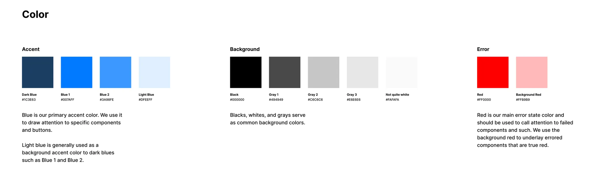
But what color would we choose? That ended up being a simple decision. As simple as black and white actually. Our ethos for the company was simplicity after all, and we wanted to reflect that in the design. There’s something very familiar about black and white, like black lead on white paper. We figured, “Let’s start here, then add accents of color as we go on.” That was good enough for us - no need to complicate it while we’re moving fast.
Very quickly, though, we added our first two accent colors: blue and red. Blue for success states and key points of information, red for errors and warnings.
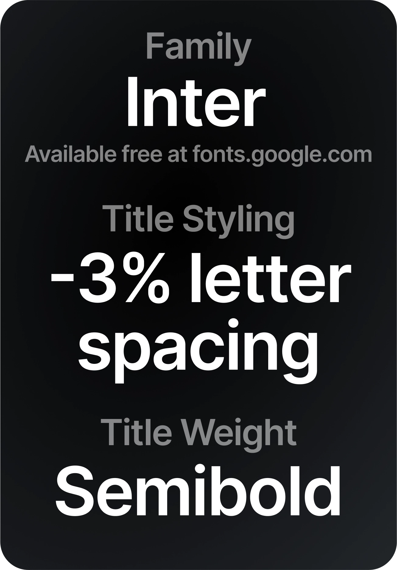
Next, we needed a font. I’d been following Rasmus Anderson on Twitter for a while when he started tweeting about his development of Inter. Of course, if you’re in the design world and know about fonts, you may know that Inter has become quite common, but we applied it before it became so ubiquitous and liked it for its crisp legibility.
Home
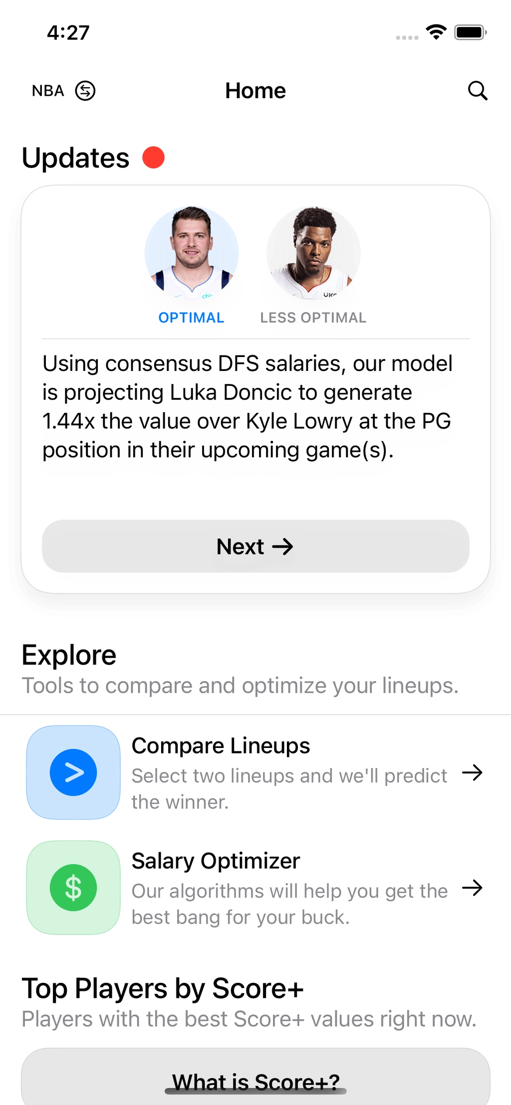
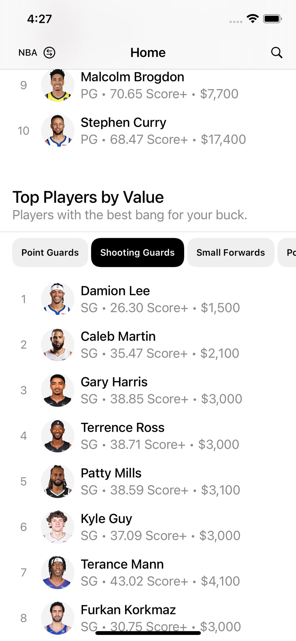
The homepage contains a few defined sections:
- Updates. A stack of cards showing daily updates that predict which players will do better than others in upcoming games.
- Explore. Fantasy tools go here as we add them. So far it has Compare Lineups and Salary Optimizer which I’ll write about later.
- Top Players by Score+. The top 10 players ranked by Score+.
- Top Players by Value. The top 10 players ranked by Value (essentially a ratio of salary and Score+).
What is Score+?
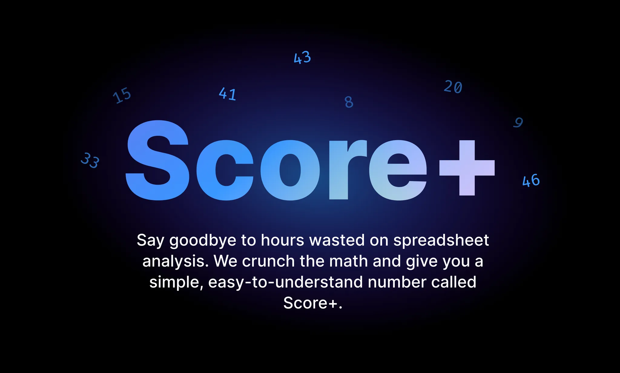
You’ll see Score+ mentioned often here so let’s define it. Score+ is SportAI’s in-house player performance predictor value.
That’s a bit of a mouthful, but basically, every player has a Score+ assigned to them and it predicts how well (in a fantasy sports context) they will do in their next game.
Score+ values update once a day.
Compare Lineups
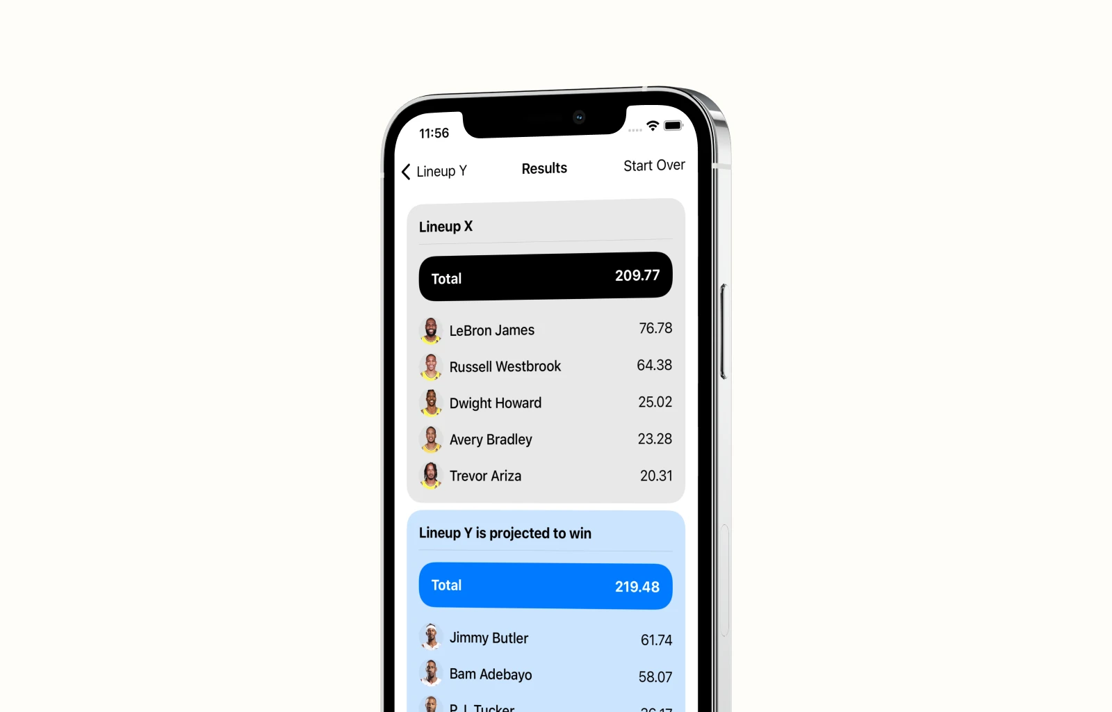
Previously called “Optimize”, this was the feature that was mocked up before I joined the company. Here, users select two lineups and compare their chances of success in upcoming games.
Every player’s Score+ gets added to their lineup’s total, then the app tells you which lineup has the higher total. So it is simple for now, but we plan to add features to it in the future.
Before I redesigned it it was difficult to understand what the intended flow was. So I broke it down into three simple steps:
- Select players for the first lineup
- Select players for the second lineup
- Compare the two
After some rough drafts, I landed on this flow and created a Figma prototype:
It allowed selecting players in “your” and “your opponent’s” lineup from a single view. Users could clearly see which players they selected at all times.
I liked the idea of only having to swipe back and forth between the two, and still do, but due to engineering constraints brought up by the frontend engineer at the time, we went with a more straightforward approach. I’m happy we did, because it is quite simple to use and it was easy to develop.
We limited the number of players you could insert into a lineup to five, but we didn’t set a minimum, meaning users could compare one player to five others. This isn’t uncommon. Users might be considering one really high scoring, expensive player or five average, cheaper players.
Salary Optimizer
The salary optimizer was our next big feature. It was a classic knapsack problem. Say a user wants a lineup of 5 players, but they can’t decide the best value lineup from a selection of 8 players that fit their fantasy budget. The backend team’s job is to solve that common question using Score+.
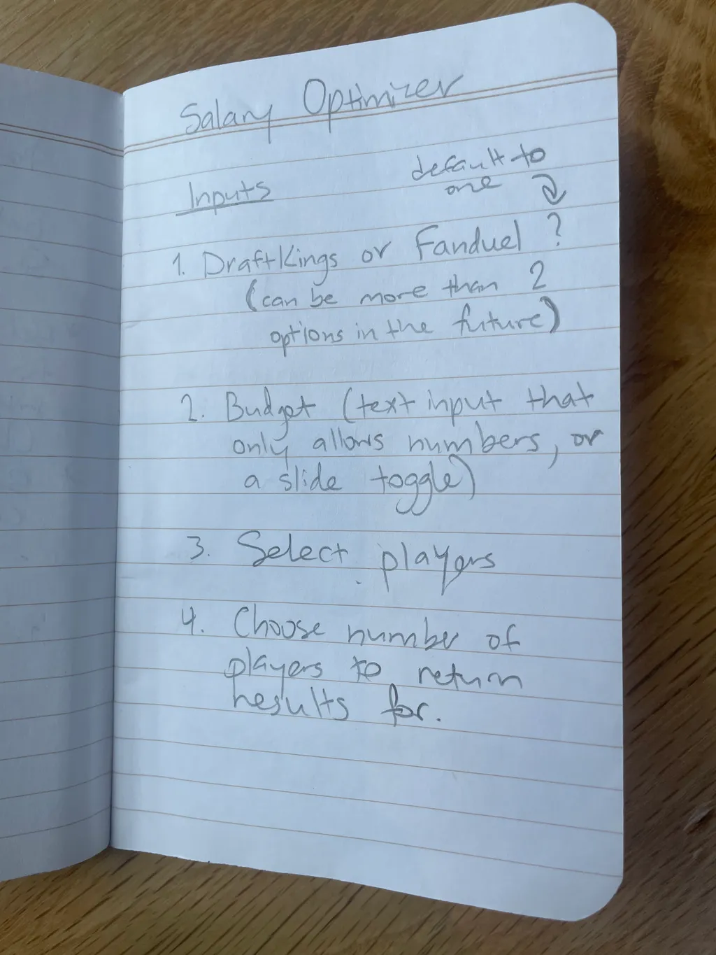
But how do you design for a knapsack problem like this one? Well, I started by jotting down the parameters users would have to input.
- Fantasy platform
- Salary Budget
- The players you’re considering
- The number of players you want in your final lineup
Users need access to these variables every time they use this feature, so they need to be accessible before every use of the feature.
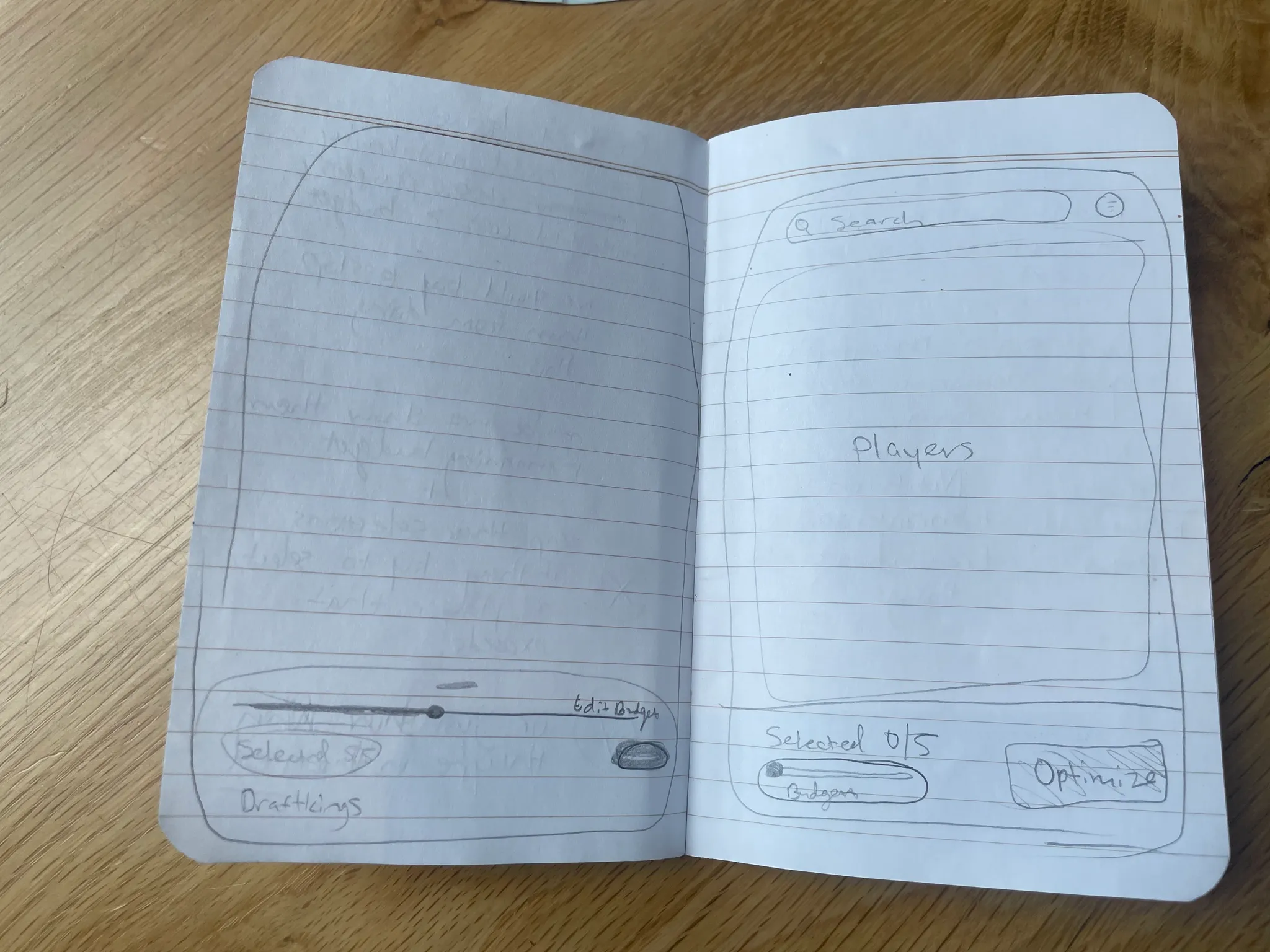
I explored the idea of a bottom drawer with parameter inputs always available. This seemed like a good idea at the time because it reduced the number of pages to navigate...
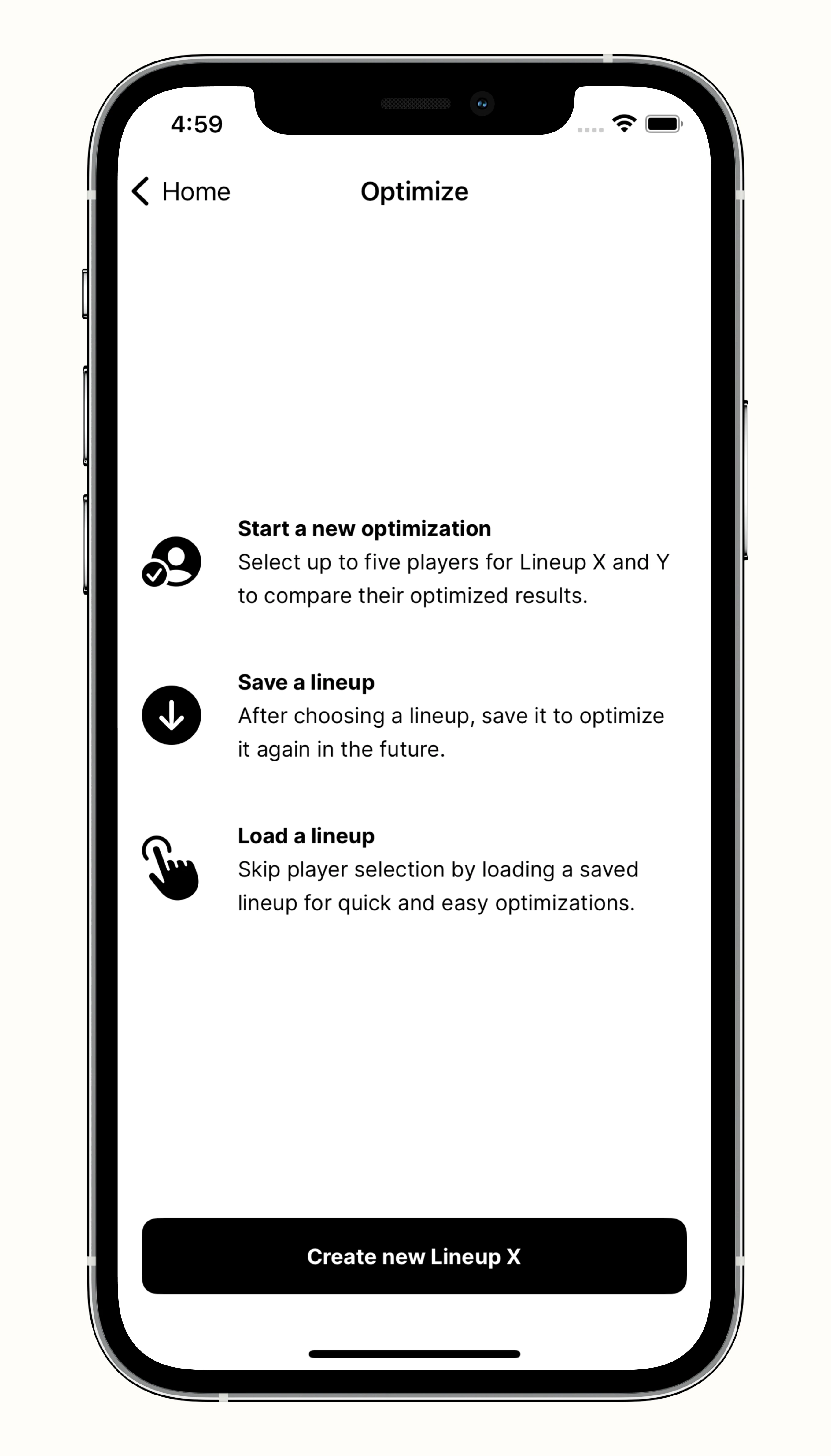
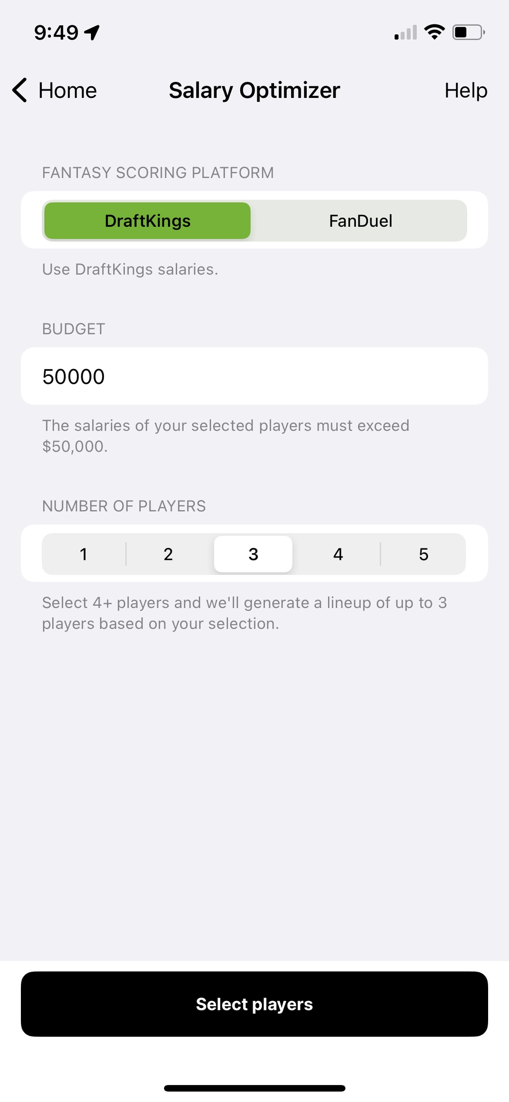
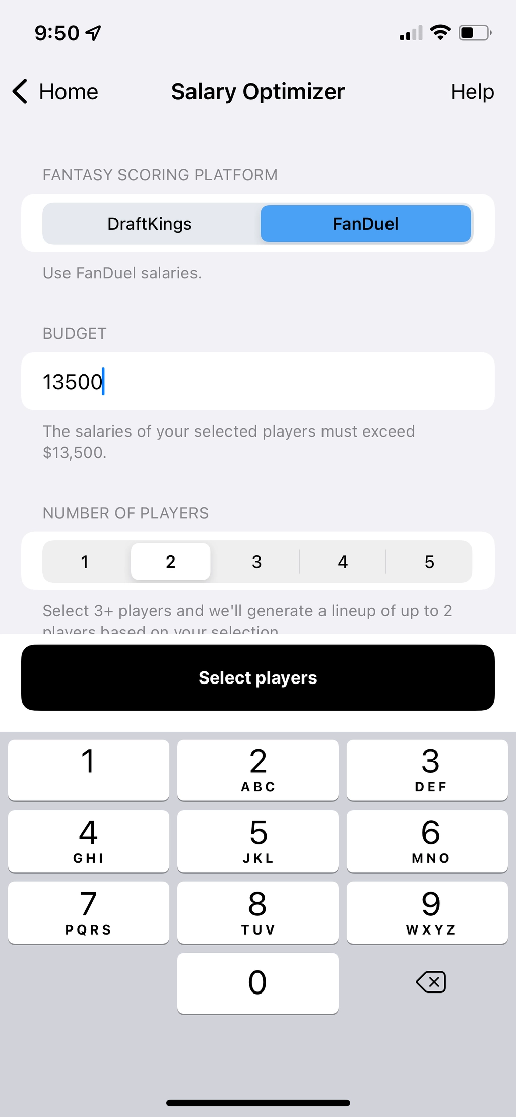
... but we opted for a more straightforward design: a “menu” page. That way users can select their parameters, then those inputs get out of the way to let users focus on searching the players they’re considering.
- We color coordinate the fantasy platform selected with their respective company’s main color (green for DraftKings, blue for FanDuel).
- For the budget input we opt for a digit text field as opposed to a slider or an increment counter because it allows more granularity of values (i.e. salaries aren’t always divisible by 1000 or 100 or 10).
- The input descriptions change based on user inputs to better describe what’s happening when they change values.
Then onto the player selection. Here we keep some aspect of the bottom drawer to keep track of user’s current cost. If a user tries to move ahead with improper selections for any reason, toast errors are triggered to guide them.
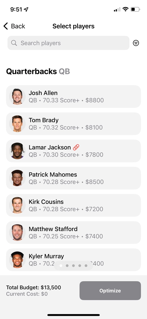
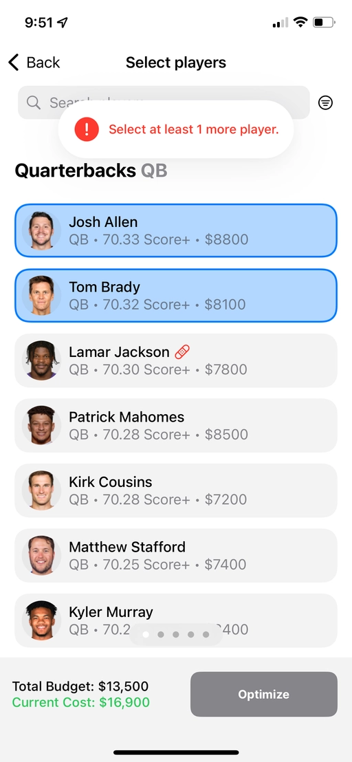
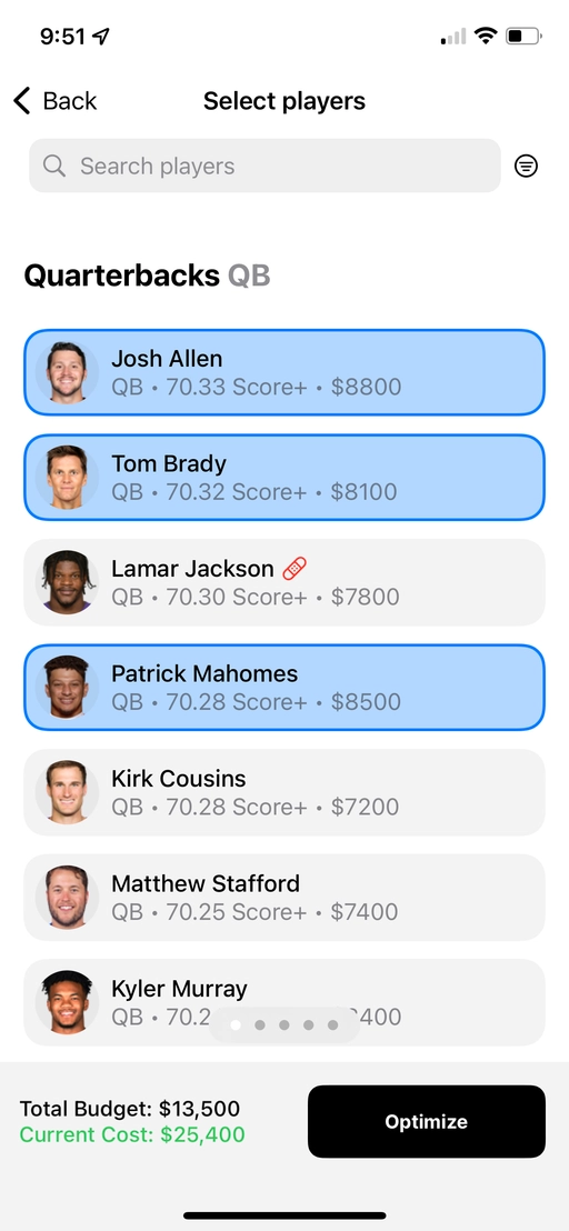
In keeping with our design ethos, the Results were made to be as simple as possible. We’ll add to it over time, but for now it contains
- a description,
- a list of players,
- and the lineup’s cost.
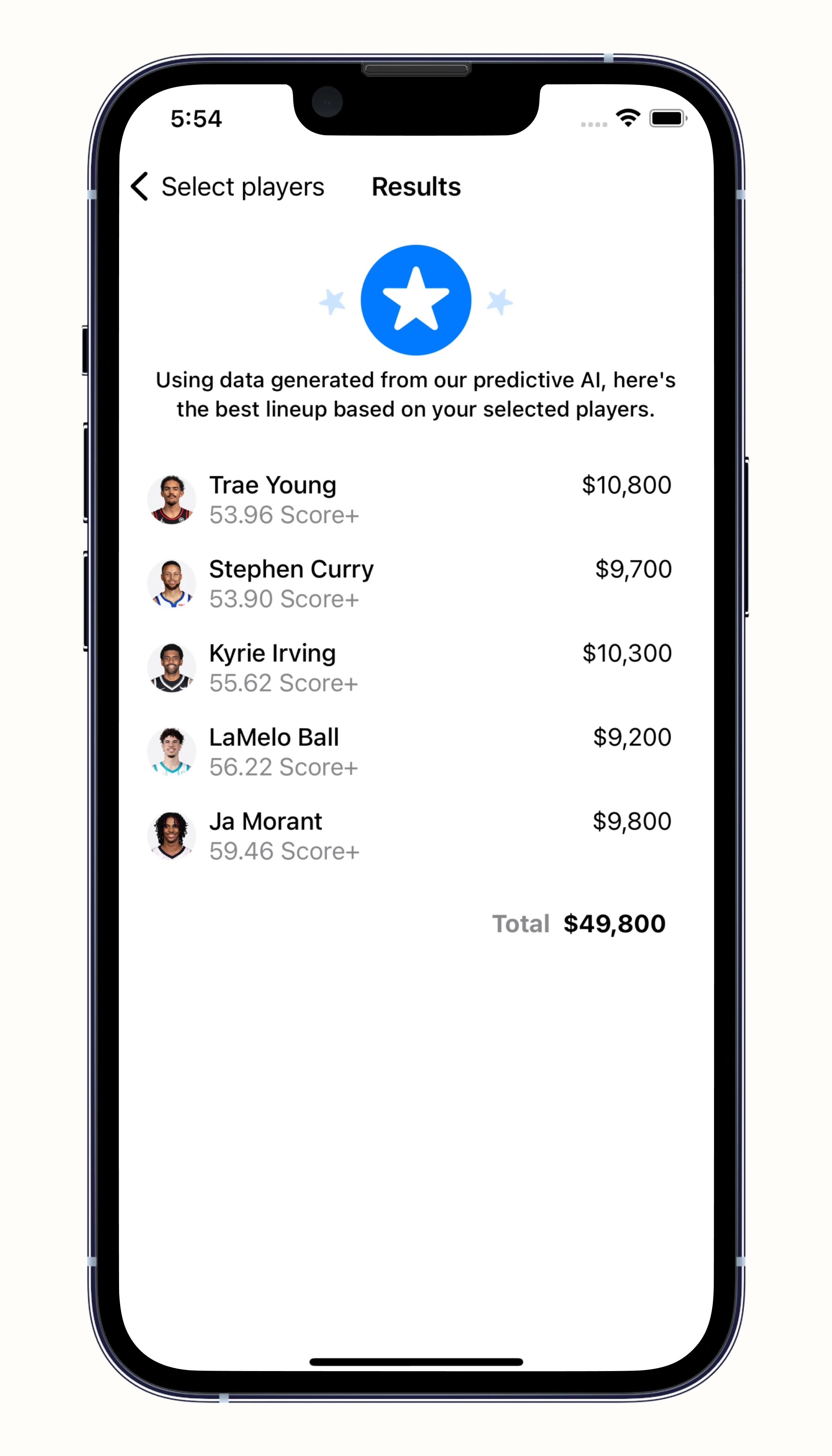
I gave the star header an animation for a bit of visual interest too.
Website
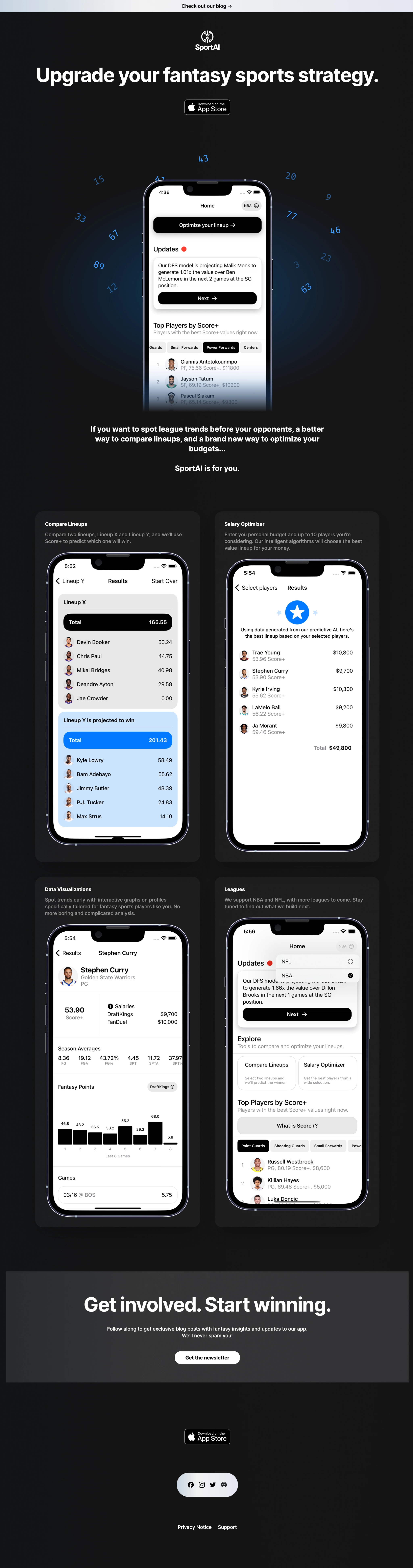
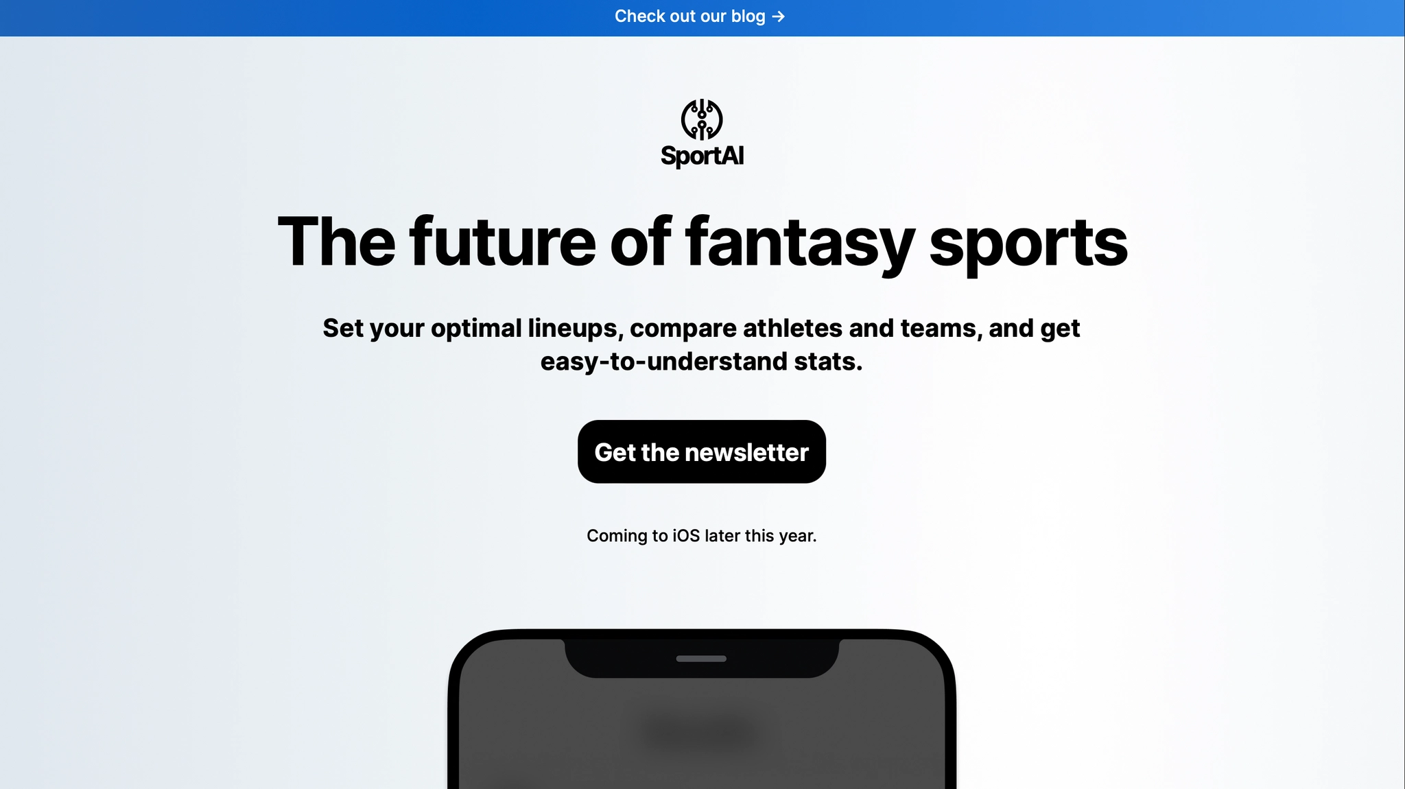
App Store Screenshots
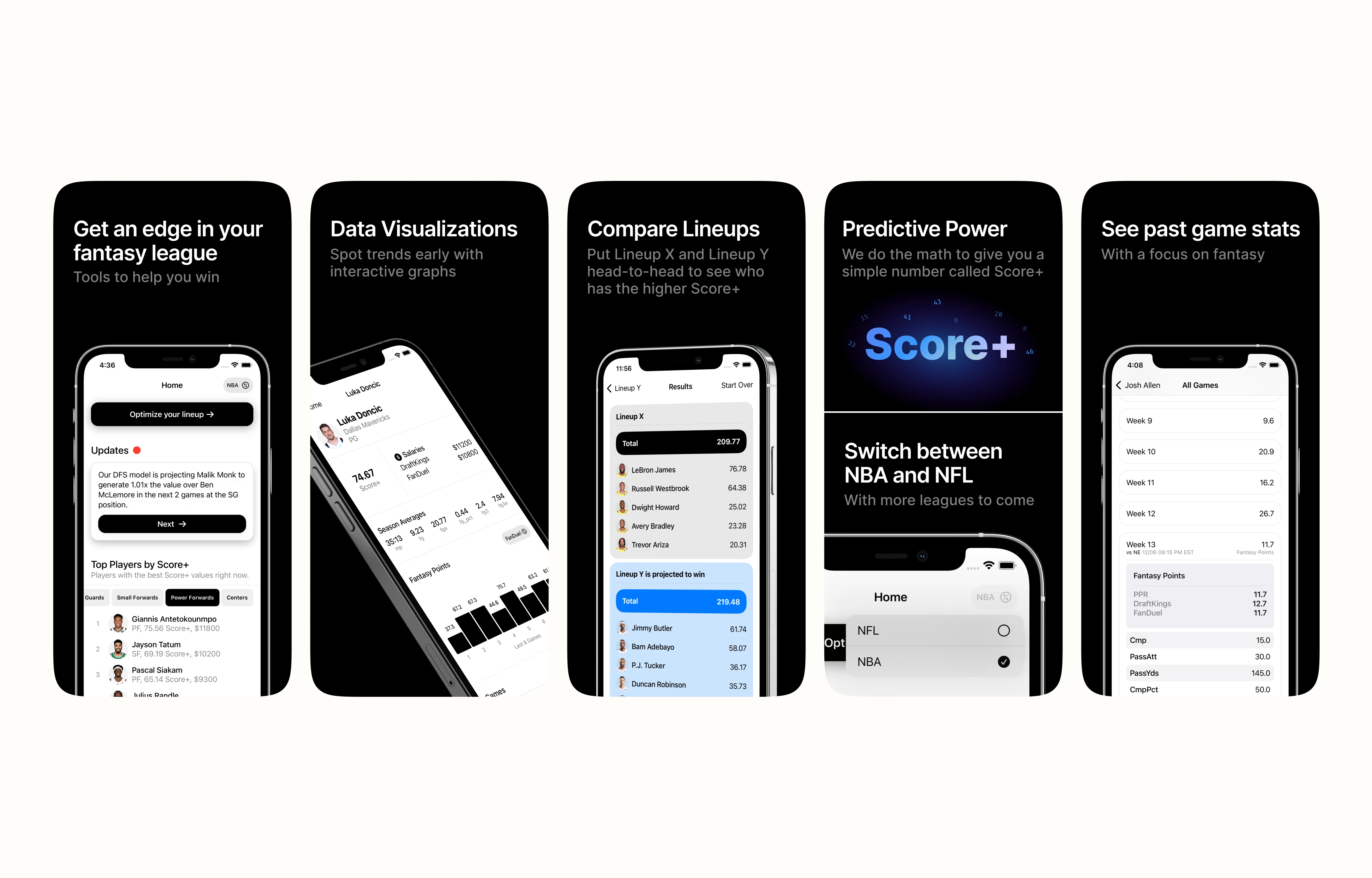
App Store Reviews
…app is butter smooth and has great graphs/visuals. ⭐⭐⭐⭐⭐ - ThomasCoiner
…it’s intuitive, easy to use, I just hopped straight in and was looking at stats and top picks. Great design, will be using in the future for sure. ⭐⭐⭐⭐⭐ - Hunter Cowper
I can tell the developers put a lot of effort and thought when designing the user interface of the app! ⭐⭐⭐⭐⭐ - JoeH19204826
Absolutely blown away by the optimization. A must have for any NBA/NFL fans. ⭐⭐⭐⭐⭐ - Jeremy Sargent II
Great starting feature set! Gonna be watching for what comes in future updates! ⭐⭐⭐⭐⭐ - peanutbutterandjenna
More Work
Product highlights
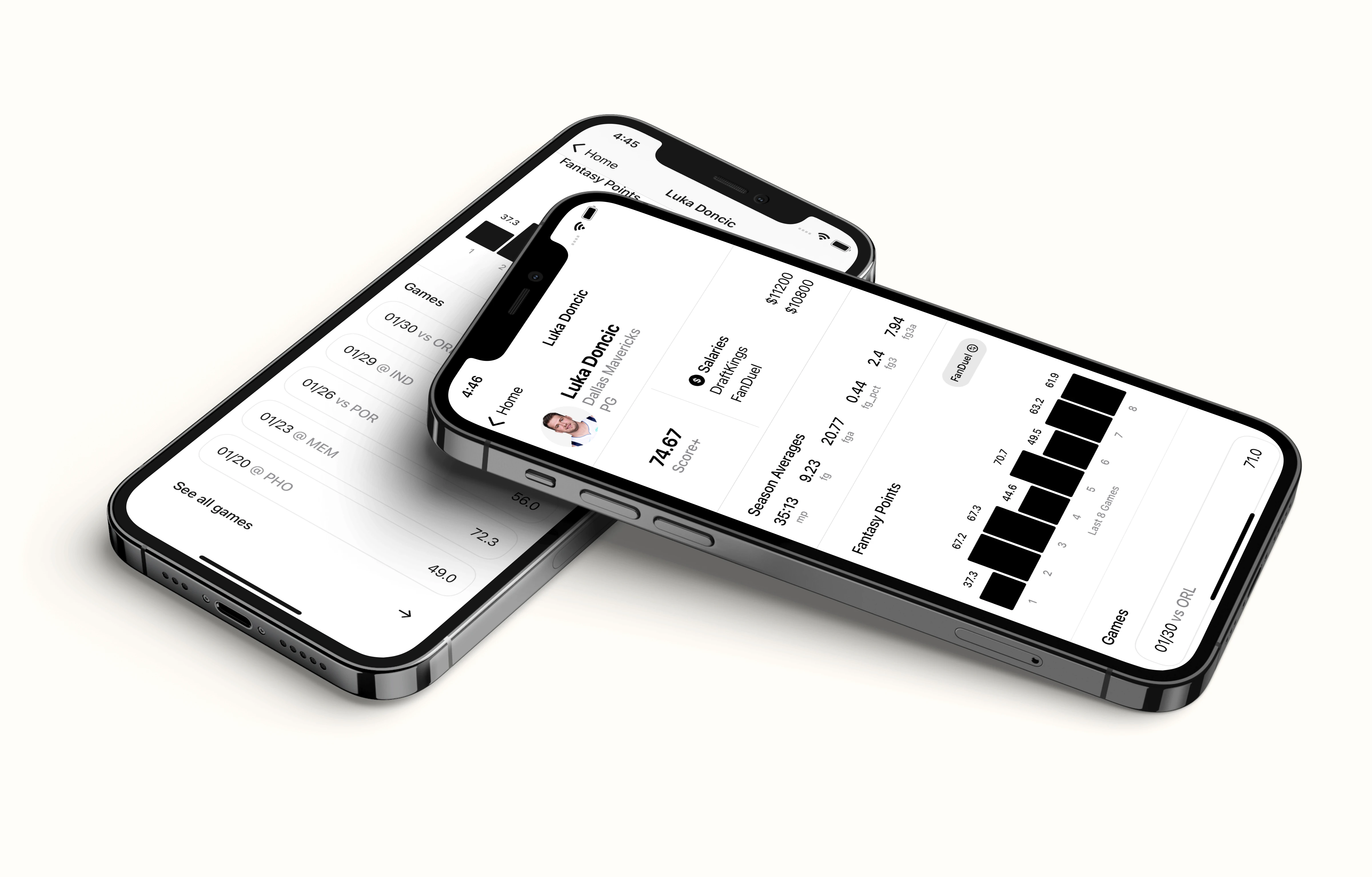
Marketing

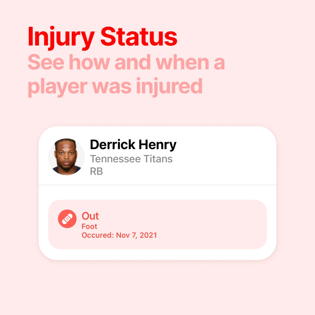
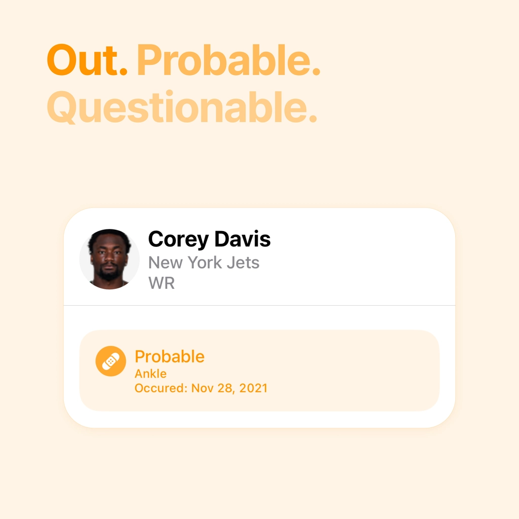

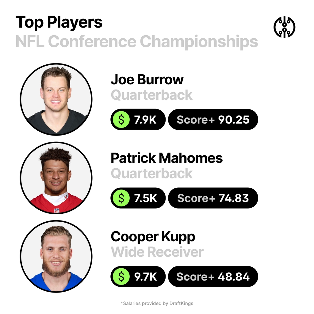

Branding

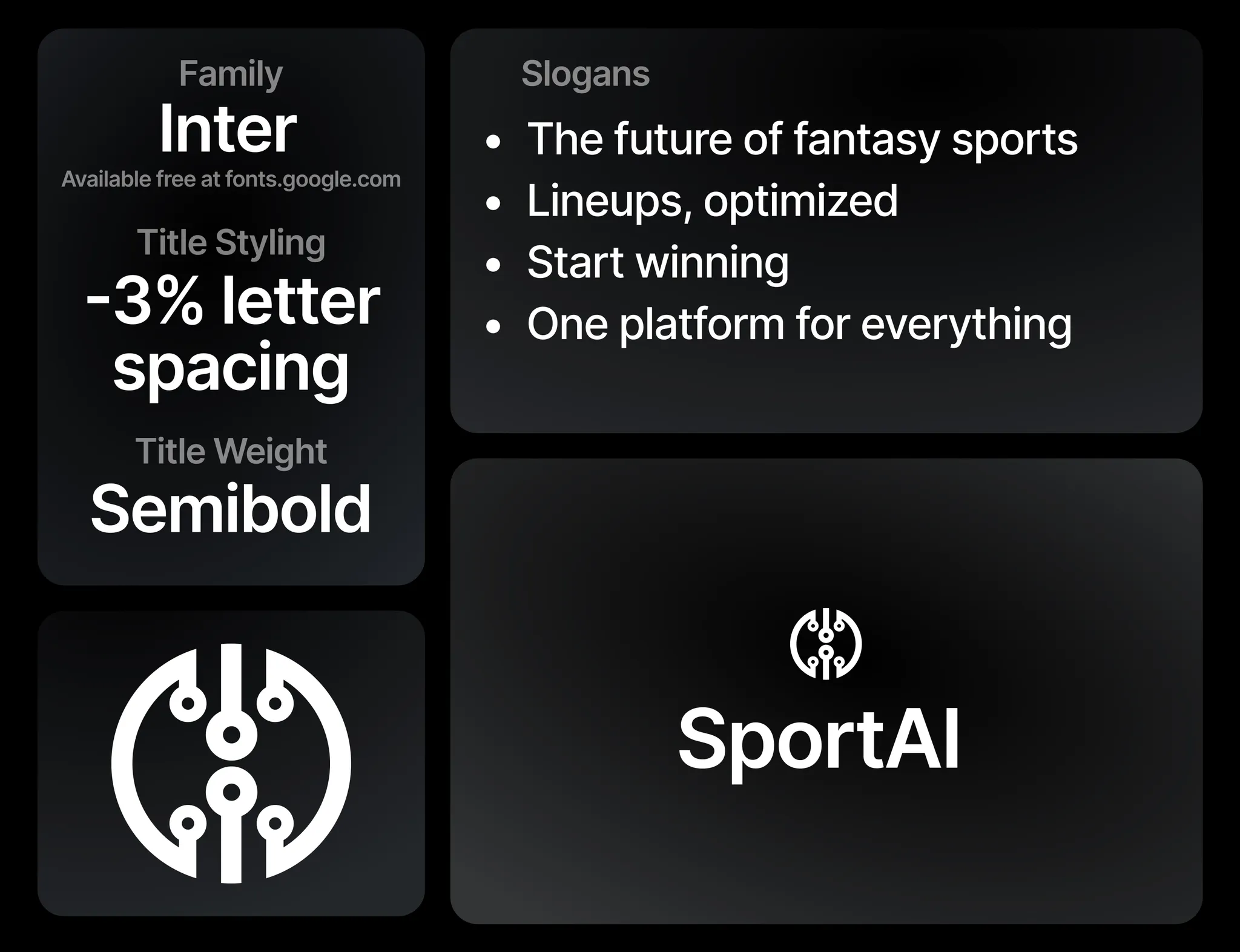

Early concepts